The magic of snowflakes – from studying nature to design
Sometimes ideas arise very quietly.
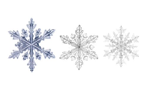
This project did not begin with a finished concept, but with a fascination: real snowflakes. Their delicate geometry, their fragile symmetry, and the fact that no two are alike have long impressed me.
I studied photographic references, analyzed details, and began sketching the shapes in Procreate. My goal was not to copy snowflakes exactly. Rather, I wanted to understand how they are structured—how lines branch out, how symmetry is created, and where small irregularities create tension.
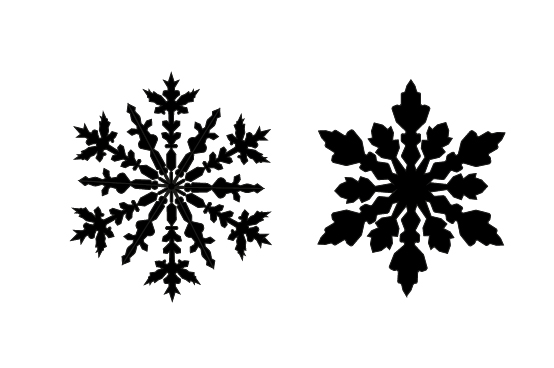
From these observations, I gradually developed my own system of forms. In Adobe Illustrator, I constructed the sketches precisely, refined the lines, and balanced the proportions. The transition from freehand drawing to clear vector forms was a conscious process: nature meets structure.
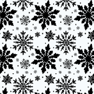
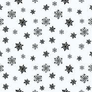
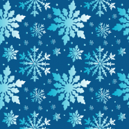
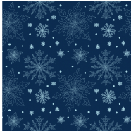
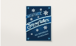
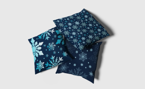
The choice of colors was also no coincidence. Deep blue tones, cool ice nuances, and a clear turquoise accent reflect the tranquility and clarity of winter landscapes for me. The color system supports the design language and gives the design depth and atmosphere.

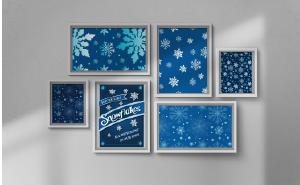
The result is a winter collection of posters and seamless patterns—inspired by nature, further developed in design.
Perhaps this project also reminds us of what makes snowflakes so special: each one is unique. And that is precisely where their beauty lies.